Overview
GGE was developed for Iberdrola as a platform focused on employment, training, and educational resources linked to the green economy.
The experience needed to support different audiences, from job seekers and students to institutions and corporate stakeholders, while staying clear, credible, and easy to navigate.
Role
UI Designer
Contributing to product structure, feature definition, system scalability, and visual identity.
Deliverables
0→1 MVP
Product Definition
Information Architecture
Interaction Design
UX/UI Design
Design Systems
Creative Direction
Credits
Juan Sisinni [Product Designer]
Miguel González [Product Manager]
Marcus Stenbeck [Full Stack Engineer]
Cristina Fresneda [Full Stack Engineer]
Joaquin Castañeda [Graphic Designer]
Tools
Figma
Adobe Creative Suite
Timeline
04/2023 - 02/2025
The-Problem_01
This wasn’t a typical job platform. We didn’t own the core interaction. The platform risked becoming a low-value aggregator.
Users were redirected to external providers to complete applications, which meant:
No control over conversion
No tracking of user behaviour post-click
No ability to optimise the application flow </aside>
We focused on creating value before and beyond the application moment.
Early-Iterations_02
After
As the product evolved, we introduced: stronger color usage, more expressive visuals and richer component system. This helped align the interface more closely with the platform's identity.
After
As the product evolved, we introduced: stronger color usage, more expressive visuals and richer component system. This helped align the interface more closely with the platform's identity.
Product-Architecture_03
We designed the platform as a multi-entry ecosystem.
This allowed users to enter from different motivations, not only job searching.
Strategic shift:
From applying to jobs → to green career navigation.
Jobs
Opportunities from external providers.

Education
Courses and master’s degrees linked to green careers.
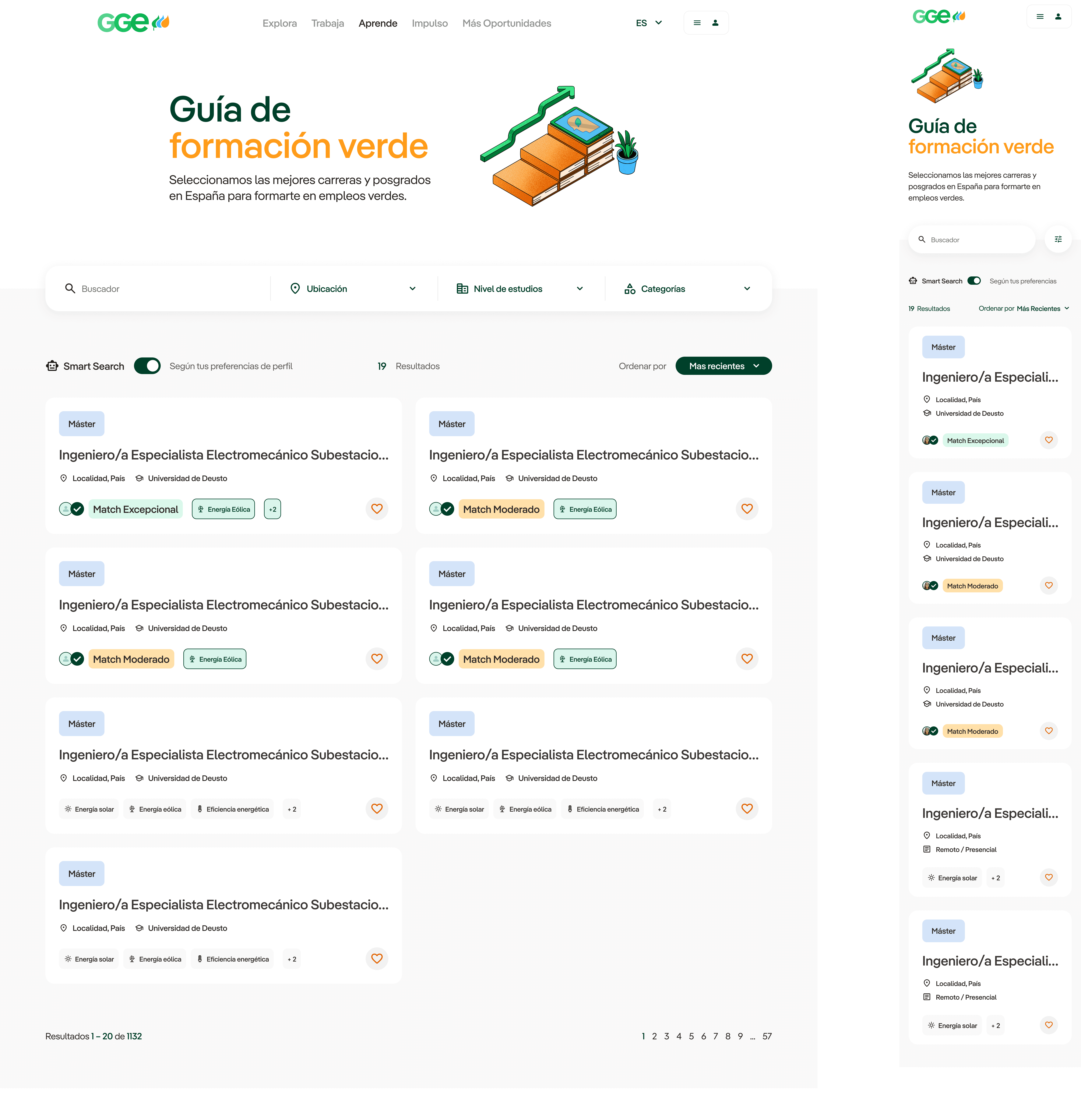
Explore

Data and insights on green employment trends.
Key-Decisions_04
The product was shaped through a series of decisions driven by constraints, not features. Each decision focused on creating value beyond the application flow.
Green Categorization System
We created a classification model of 16 green sectors (renewables, energy efficiency, industrial, etc.) This helped: structure the platform, simplify navigation and educate users about the ecosystem.
Explore (Data Layer)
We designed a data-driven experience. This positioned the platform as informative and strategic.
Interactive maps showing employment trends in Spain
Later expansion to UK markets
Visual insights into green sectors
Skill-Based Matching
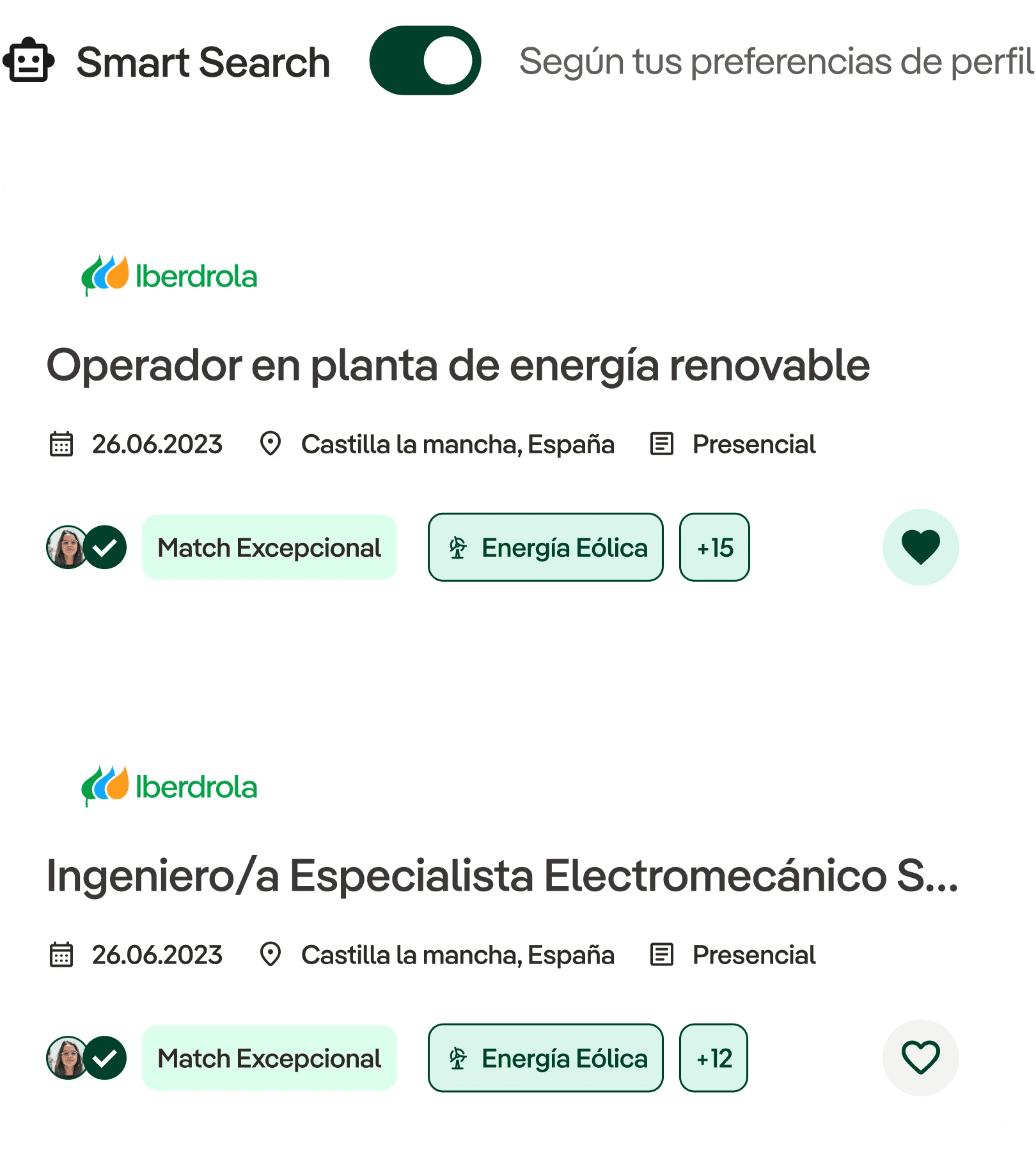

We introduced “abilities” linked to each category. These connected to jobs and education.
We later enabled recommendation labels such as: Good fit, strong match, exceptional… This shifted the experience from browsing → guided discovery.
Personalised Profiles
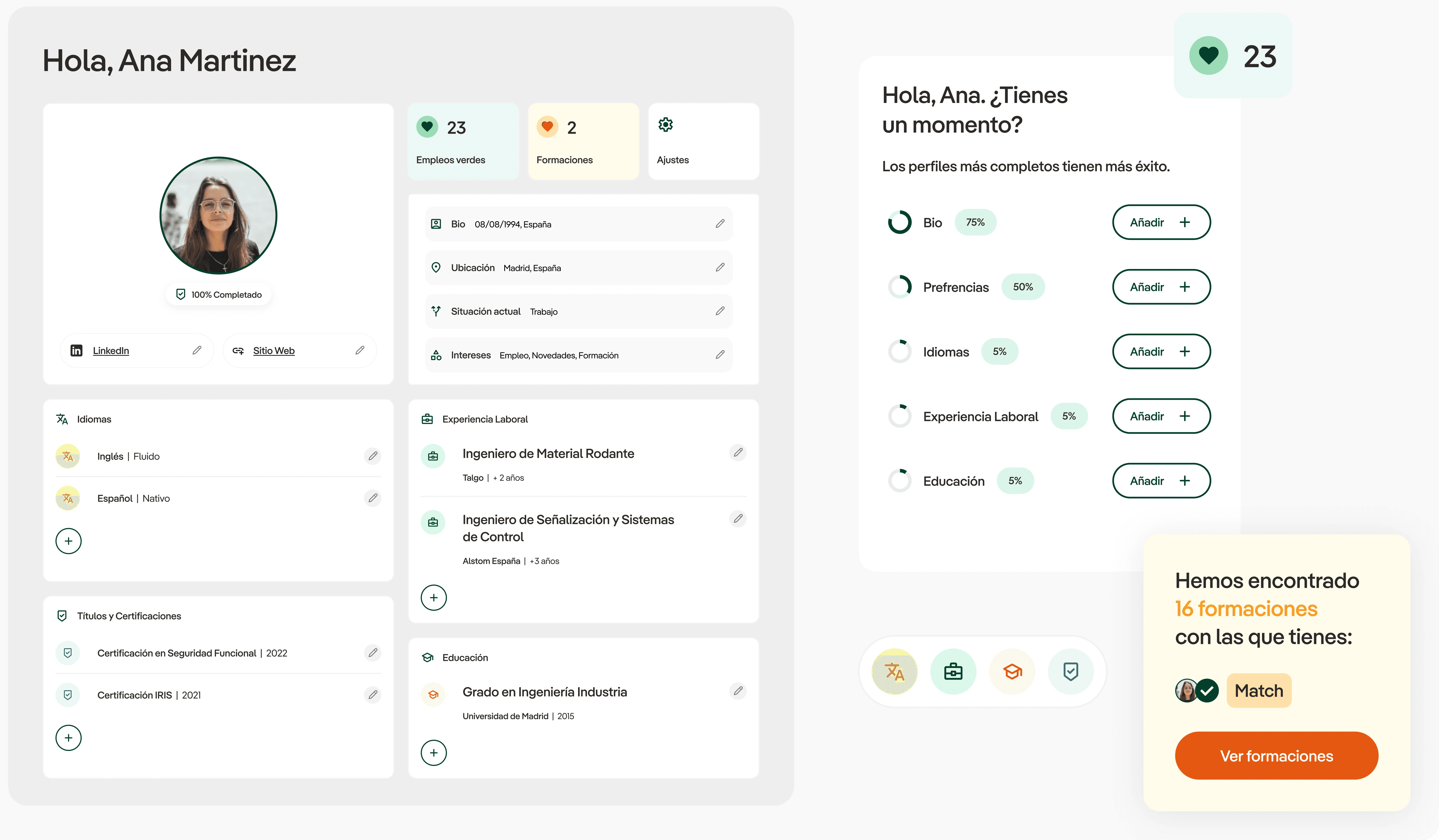
The profile system was designed to be detailed without feeling intrusive. This information will later be useful when users are redirected to external job providers.
Users could gradually complete: bio, experience, education, languages and preferences. We added profile completion indicators to encourage progressive onboarding and improve profile quality over time.
Guided Onboarding
To reduce friction, we introduced an onboarding flow that: Helped users get a kickstart on their profile completion and provided context before users started navigating the ecosystem.
Content & Retention

We introduced a content layer that increased engagement beyond transactional use. News, events and initiatives (e.g. volunteering)
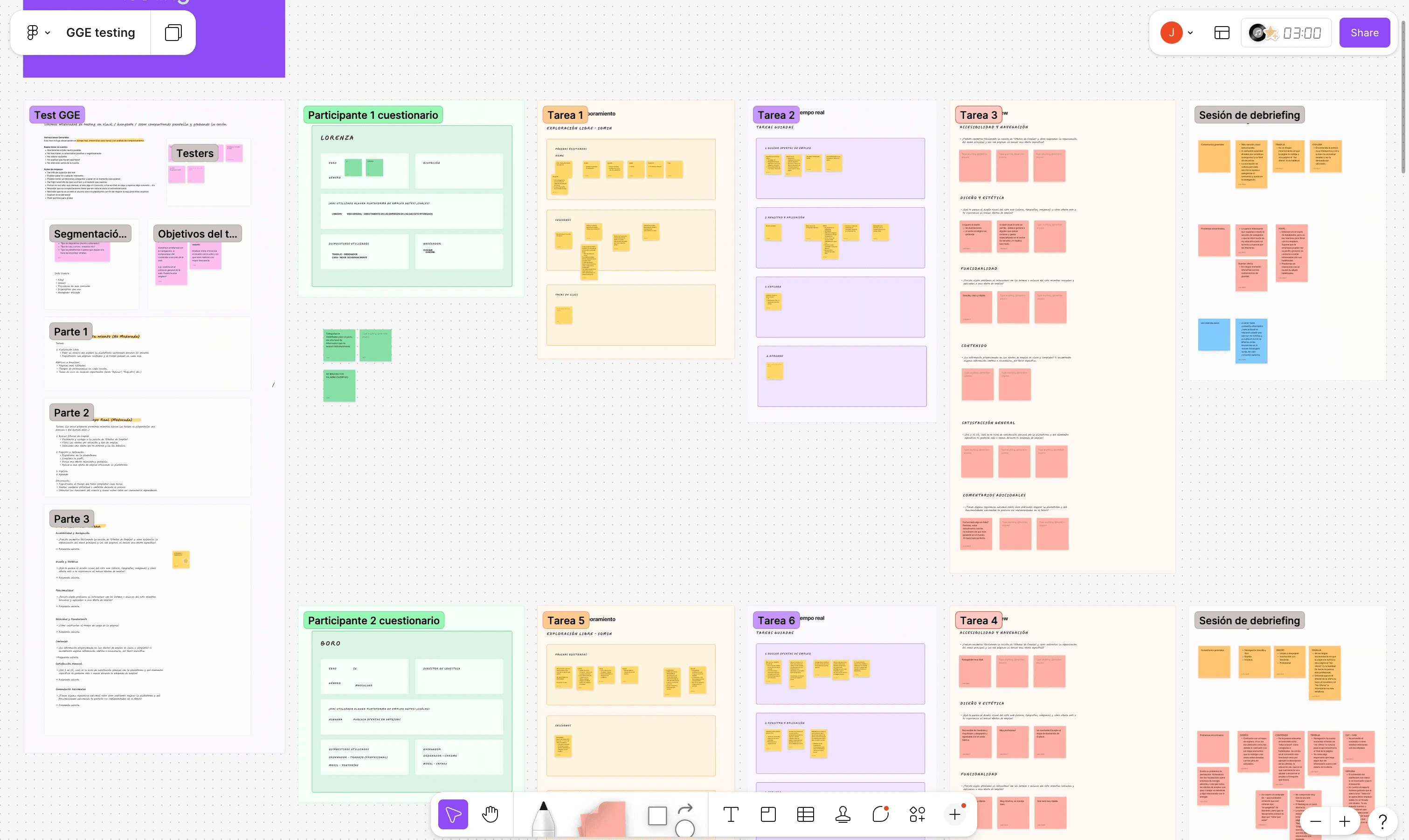
Tests-and-validation_05
We conducted usability testing with 10 users across different profiles.
Method:
5-minute free exploration
Task-based scenarios (focused on navigation and key interactions)
Outcomes:
Improved navigation clarity
Simplified complex views (especially the map)
Better understanding of categories
Overall feedback was positive, especially in discoverability and structure.
Design-AND-Brand_06
The visual identity needed to feel connected to Iberdrola while still establishing its own personality.
We developed:
A scalable design system
A distinct illustration style
A more expressive visual language
The comic-inspired icons and illustrations helped differentiate the platform from traditional employment products while making sustainability feel more approachable and contemporary.


Constrains_07
Designing the platform involved balancing multiple technical and strategic limitations.
No ownership of application flow
Dependency on third-party job providers
Multiple stakeholders
Complex and evolving scope
Product discontinued after ~2.5 years due to funding
Reflection_08
The challenge was not simply creating interfaces, but defining how the platform could provide value despite its limitations.
This project highlights:
Designing under strong product constraints
Creating value beyond the core functionality
Structuring complex ecosystems into clear experiences
Building scalable systems for growth
*Outcome: The platform scaled to include multiple regions and expanded its feature set over time. It was ultimately discontinued due to funding constraints.
Overview
GGE was developed for Iberdrola as a platform focused on employment, training, and educational resources linked to the green economy.
The experience needed to support different audiences, from job seekers and students to institutions and corporate stakeholders, while staying clear, credible, and easy to navigate.
Role
UI Designer. Contributing to product structure, feature definition, system scalability, and visual identity.
Deliverables
0→1 MVP
Product Definition
Information Architecture
Interaction Design
UX/UI Design
Design Systems
Creative Direction
Tools
Figma
Adobe Creative Suite
Timeline
04/2023 -
02/2025
Credits
Juan Sisinni [Product Designer]
Miguel González [Product Manager]
Marcus Stenbeck [Full Stack Engineer]
Cristina Fresneda [Full Stack Engineer]
Joaquin Castañeda [Graphic Designer]
Timeline
04/2023 - 02/2025
Tools
Figma
Adobe Creative Suite
Deliverables
0→1 MVP
Product Definition
Information Architecture
Interaction Design
UX/UI Design
Design Systems
Creative Direction
Credits
Juan Sisinni [Product Designer]
Miguel González [Product Manager]
Marcus Stenbeck [Full Stack Engineer]
Cristina Fresneda [Full Stack Engineer]
Joaquin Castañeda [Graphic Designer]
Role
UI Designer
Contributing to product structure, feature definition, system scalability, and visual identity.
The-Problem_01
This wasn’t a typical job platform. We didn’t own the core interaction. The platform risked becoming a low-value aggregator.
Users were redirected to external providers to complete applications, which meant:
No control over conversion
No tracking of user behaviour post-click
No ability to optimise the application flow
We focused on creating value before and beyond the application moment.
Early-Iterations_02
After
As the product evolved, we introduced: stronger color usage, more expressive visuals and richer component system. This helped align the interface more closely with the platform's identity.
Product-Architecture_03
We designed the platform as a multi-entry ecosystem.
This allowed users to enter from different motivations, not only job searching.
Strategic shift:
From applying to jobs → to green career navigation.
Jobs
Opportunities from external providers.
Education
Courses and master’s degrees linked to green careers.
Explore
Data and insights on green employment trends.
Key-Decisions_04
The product was shaped through a series of decisions driven by constraints, not features. Each decision focused on creating value beyond the application flow.
Green Categorization System
We created a classification model of 16 green sectors (renewables, energy efficiency, industrial, etc.) This helped: structure the platform, simplify navigation and educate users about the ecosystem.
Explore (Data Layer)
We designed a data-driven experience. This positioned the platform as informative and strategic.
Interactive maps showing employment trends in Spain
Later expansion to UK markets
Visual insights into green sectors
Skill-Based Matching
We introduced “abilities” linked to each category. These connected to jobs and education.
We later enabled recommendation labels such as: Good fit, strong match, exceptional… This shifted the experience from browsing → guided discovery.
Personalised Profiles
The profile system was designed to be detailed without feeling intrusive. This information will later be useful when users are redirected to external job providers.
Users could gradually complete: bio, experience, education, languages and preferences. We added profile completion indicators to encourage progressive onboarding and improve profile quality over time.
Guided Onboarding
To reduce friction, we introduced an onboarding flow that: Helped users get a kickstart on their profile completion and provided context before users started navigating the ecosystem.
Content & Retention
We introduced a content layer that increased engagement beyond transactional use. News, events and initiatives (e.g. volunteering)
Tests-and-validation_05
We conducted usability testing with 10 users across different profiles.
Method:
5-minute free exploration
Task-based scenarios (focused on navigation and key interactions)
Outcomes:
Improved navigation clarity
Simplified complex views (especially the map)
Better understanding of categories
Overall feedback was positive, especially in discoverability and structure.
Design-AND-Brand_06
The visual identity needed to feel connected to Iberdrola while still establishing its own personality.
We developed:
A scalable design system
A distinct illustration style
A more expressive visual language
The comic-inspired icons and illustrations helped differentiate the platform from traditional employment products while making sustainability feel more approachable and contemporary.
Constrains_07
Designing the platform involved balancing multiple technical and strategic limitations.
No ownership of application flow
Dependency on third-party job providers
Multiple stakeholders
Complex and evolving scope
Reflection_08
The challenge was not simply creating interfaces, but defining how the platform could provide value despite its limitations.
This project highlights:
Designing under strong product constraints
Creating value beyond the core functionality
Structuring complex ecosystems into clear experiences
Building scalable systems for growth
*Outcome: The platform scaled to include multiple regions and expanded its feature set over time. It was ultimately discontinued due to funding constraints.
Julia Martí / juliamarti.es
©
2019-2026
ლ(ಠ益ಠლ
Julia Martí / juliamarti.es
©
2019-2026
ლ(ಠ益ಠლ
Julia Martí / juliamarti.es
©
2019-2026
ლ(ಠ益ಠლ